The recent movement in GME (GameStop) has been headline news in almost every financial newspaper and as the lead story on almost every network and cable news channel in the last week.
Whether by individual investors acting through chat rooms or multi-strategy hedge funds acting individually or in concert, or investor trading platforms or clearing and pay for order flow firms, they ALL should have realized that tracking momentum would have prevented the large losses, if short, and given hope to the long side traders.
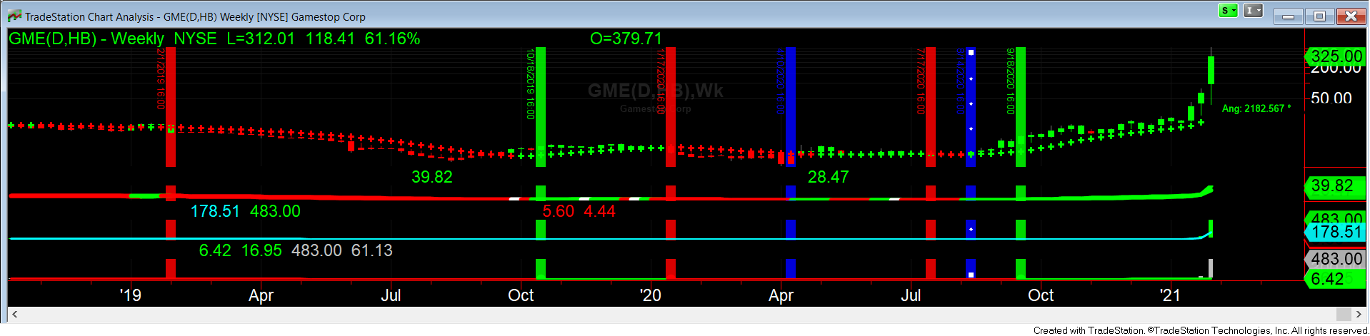
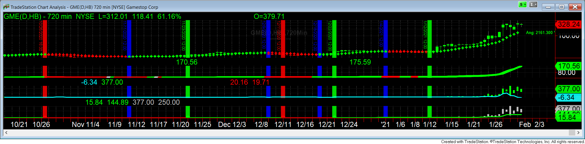
The four pictures below show the story. The linear scale has been changed to Semi-log for better illustration.
The last sale is as of the close of Friday, January 29, 2021.
Green is GO LONG, Blue is the close position, Red goes short.
Weekly:
Daily: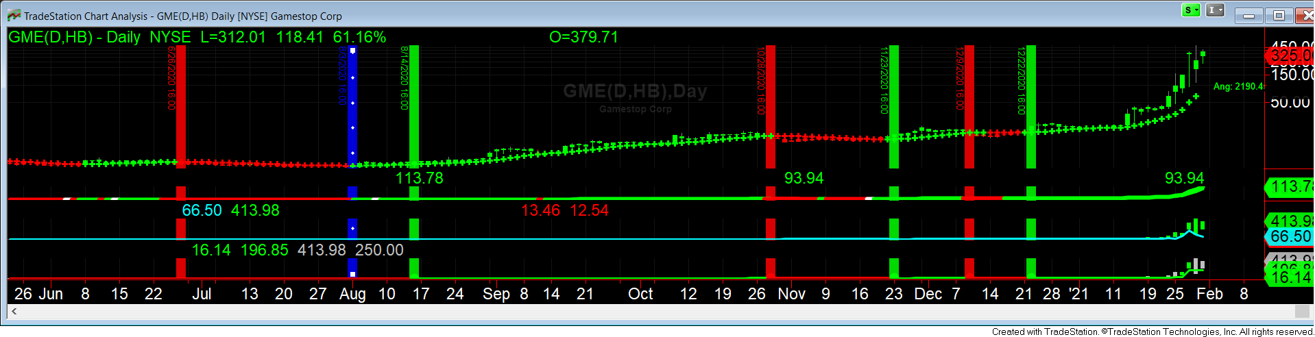
720 Minutes:
130 Minutes:

It is pretty obvious that only LONG positions should have been established starting the week after September 18, 2020, based on the weekly close. LONG-only once again after December 22, 2020. And so on with the 720 minutes after January 12, 2021, and LONG only after January 13, 2021. with the 130 minute picture.
It makes no sense looking at the above pictures of the trading history of GME over the last few weeks to understand how anyone with a plan would make try to profit from the short side of GME in the last few weeks.