As mentioned in many of my posts, I have found a method of determining if an asset is rising in price, or falling in price.
The following pictures as of the close of March 4, 2020, should illustrate a partial solution.
It is of Exxon Mobile (XOM) a widely held multinational oil company that is part of the Dow Jones Industrial Average.
The Covid 19 virus has affected many parts of the economy. The price of crude oil has been reduced. As the world economy
has slowed, the demand for crude has also been reduced.
There are two pictures. One is of the daily price of XOM by itself. The other is of XOM as compared to the S&P 500 on a relative performance basis.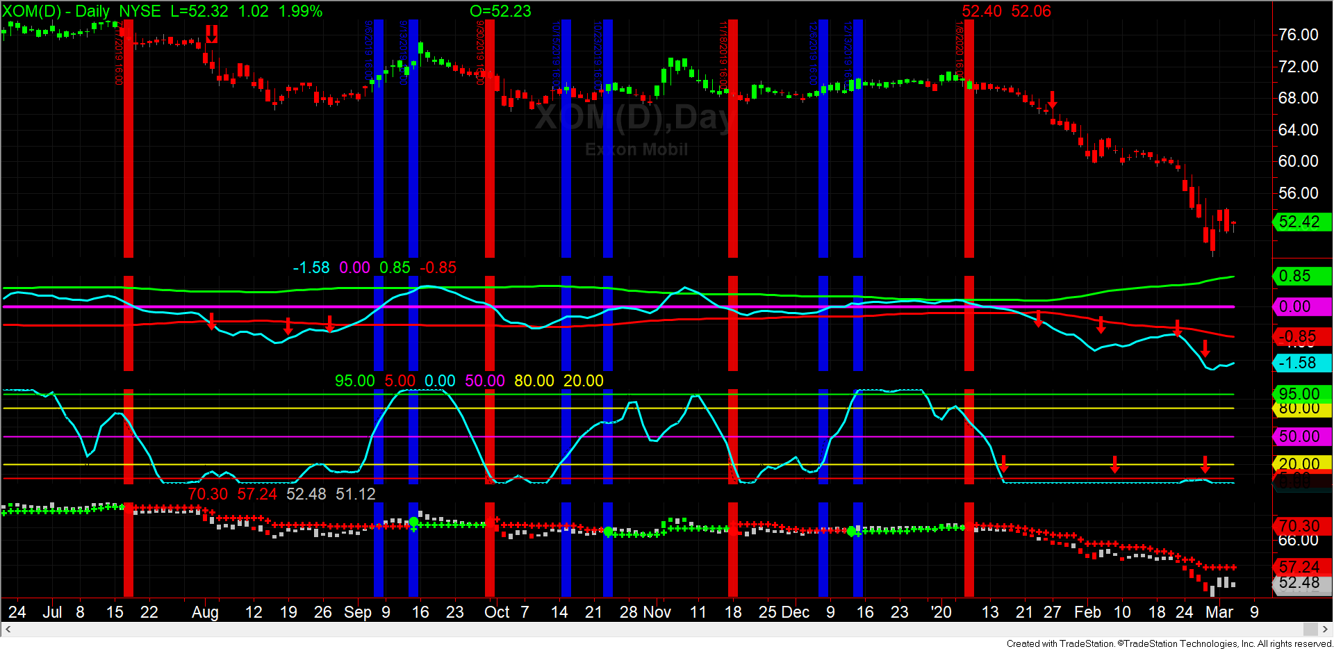
Versus the S&P 500
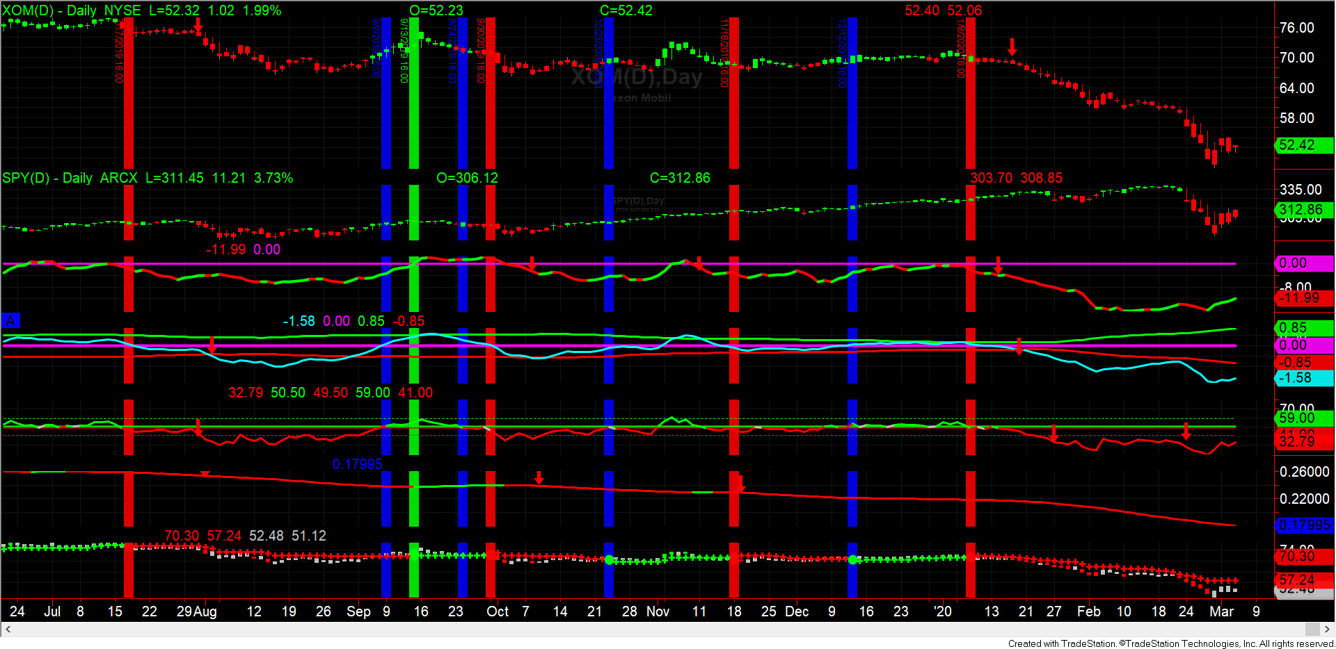
The red vertical lines represent a sell decision, a blue vertical line is a pause, a red vertical line is a purchase.
You will notice that since October of 2019, XOM has underperformed the S&P 500.